
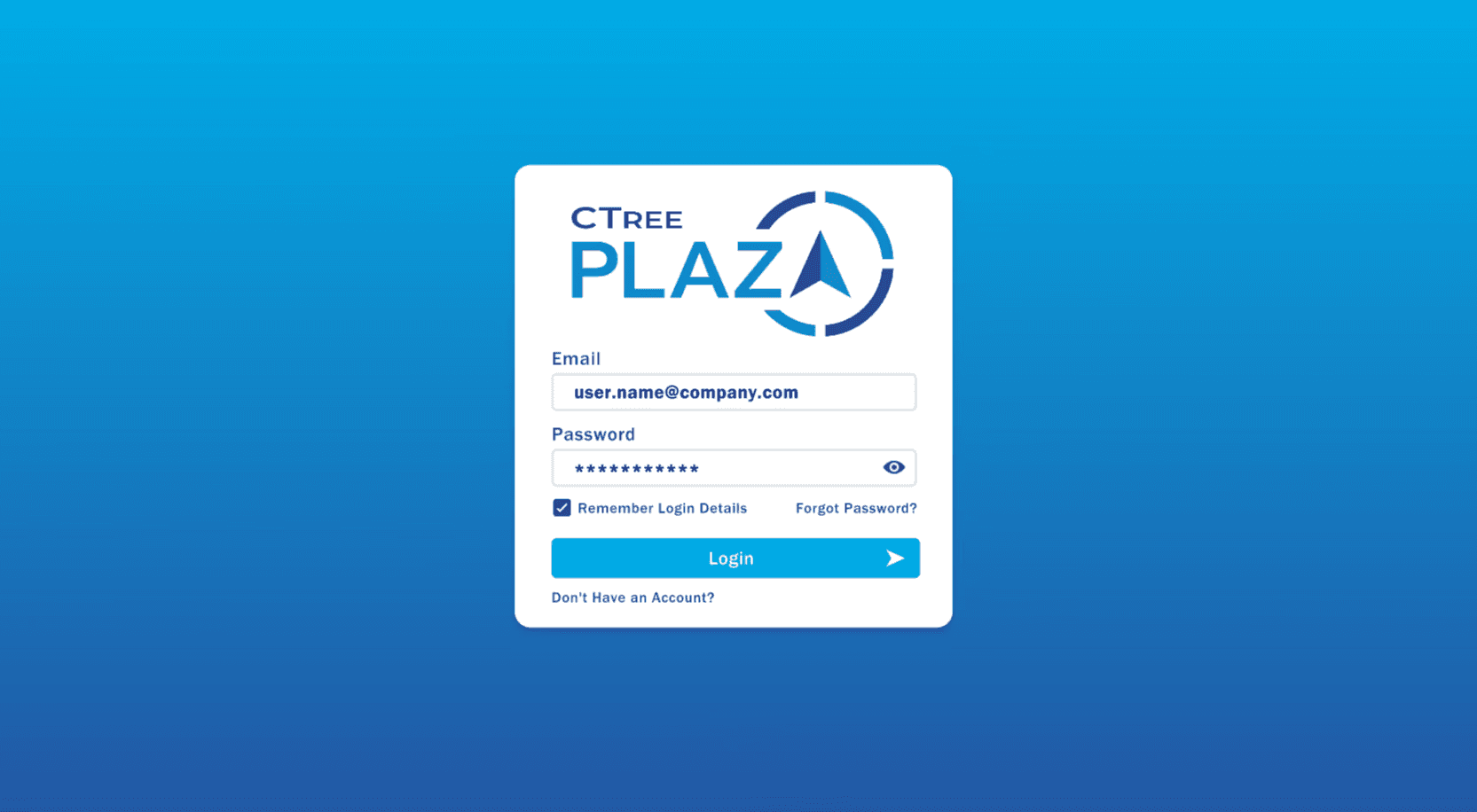
CTree Plaza Interactive Web Mockup
UI and Prototype Designer
Solo Designer
Freelance (B2B client) |
Dec 2023 - Feb 2024
Adobe XD, Illustrator, Notion |
Remote |
The Problem
Static wireframes and presentation slides were not effectively communicating the intended portal layout and interactions. This slowed backend planning and caused misalignment between stakeholders, the product team, and developers. A clickable prototype was needed to bring the concept to life and create a shared reference.
users & Pain Points
Users
Internal staff, including product managers, developers, and operations teams.
Goals
◆
Understand the intended portal structure and navigation before development
◆
Use a single, accurate visual reference during planning
Pain Points
◆
Static wireframes lacked interactivity, making user flows unclear
◆
Inconsistent references created confusion in backend discussions
◆
Missing visual hierarchy reduced ease of understanding
Client Quote
"We can’t get a sense of how the portal will work until we see it in action."
Project Scope
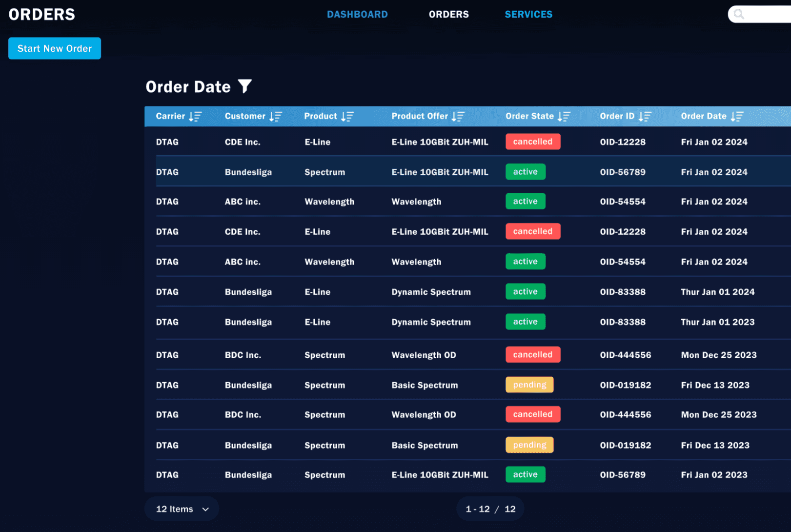
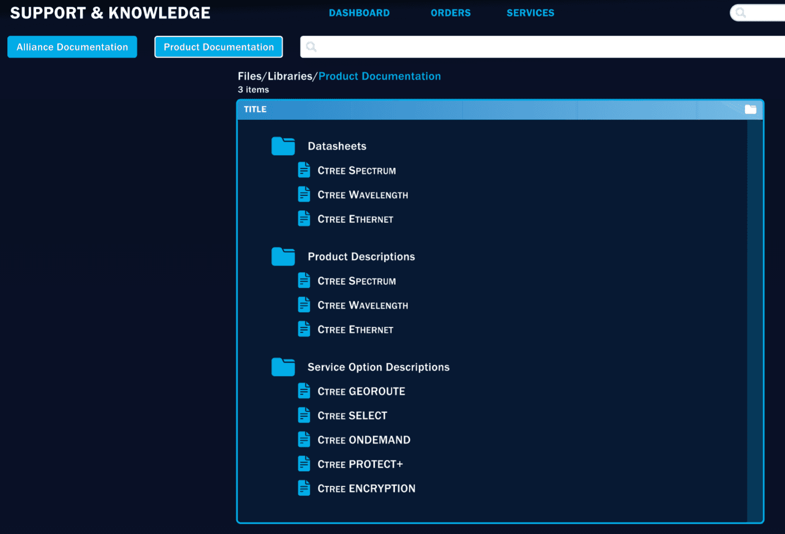
Design and deliver an interactive prototype of ConnectiviTree’s internal portal to help stakeholders and developers align on structure and navigation before development. The scope covered dashboard and page layouts, navigation flows, and visual refinements, using existing brand styles.
Process & Methods
Goal
Create a navigable mock-up that could be used in planning discussions.
Approach
1.
Gathered requirements from the CTO/VP via business docs
2.
Reviewed existing sketches to identify unclear or incomplete areas
3.
Used the existing dashboard style as a foundation for consistency
4.
Developed layouts and navigation flow, refining based on informal stakeholder feedback
Prototyping
Created initial wireframes in Adobe XD to establish structure and navigation. Focused on clarity over decoration to ensure the mock-up was easy to follow for backend planning. Built a clickable prototype linking key pages and simulating navigation flow.
Focus Areas
◆
Clear navigation structure for consistent wayfinding
◆
Minimal visual distractions to emphasise functionality
◆
Consistency with existing dashboard style

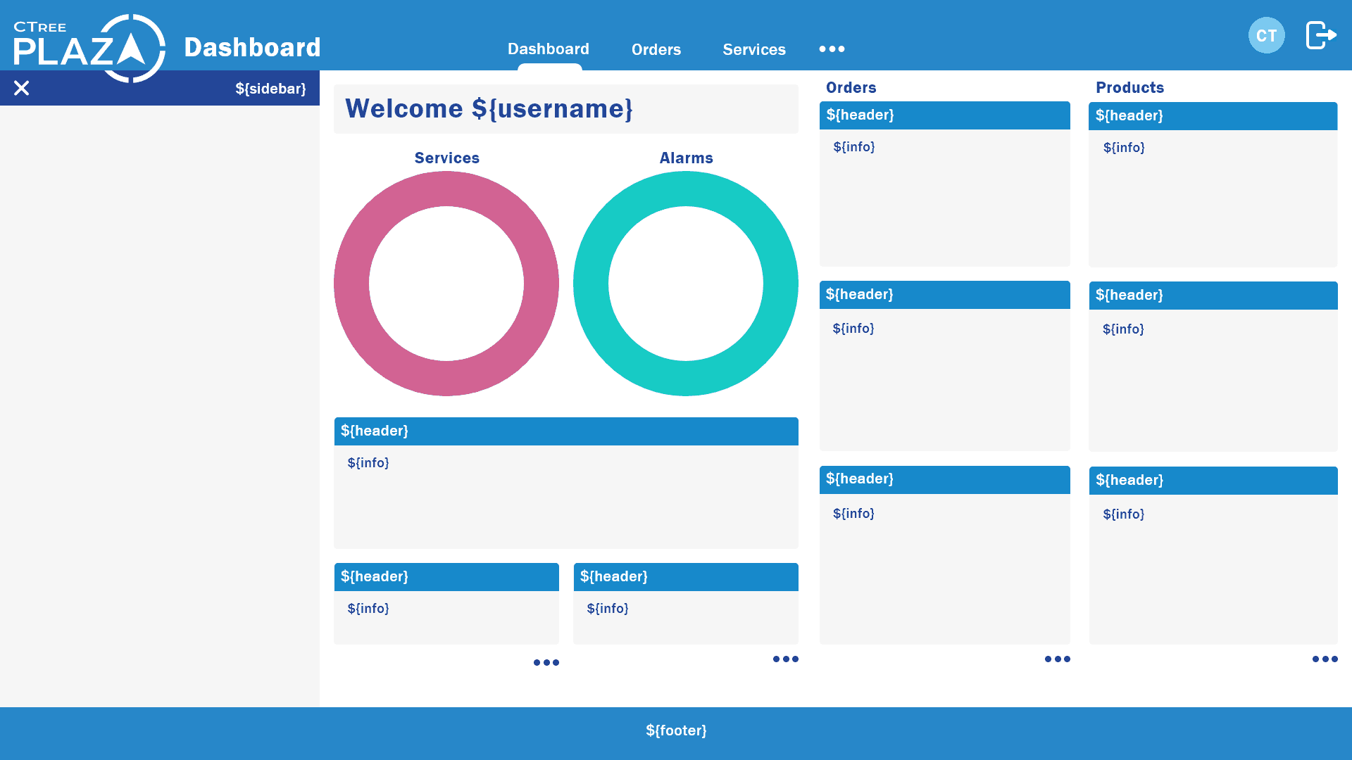
Iteration 1
Feedback
The sparse layout didn’t provide enough information at a glance, and navigation options were not obvious. The lack of visual grouping made the content feel disconnected.
Actions
◆
Added tile counts for quick content scanning
◆
Introduced gradients and shadows to create depth
◆
Developed sidebar for persistent navigation across pages
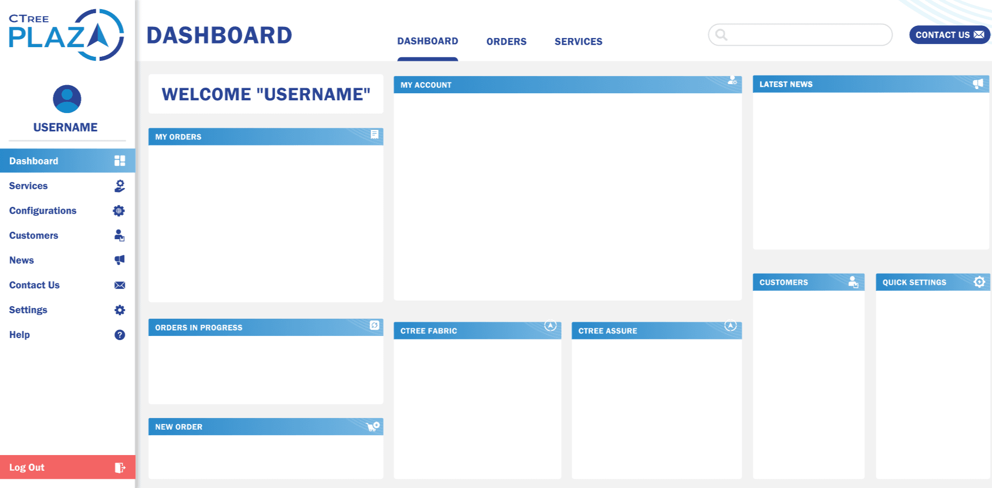
Iteration 2
Feedback from CTO/VP
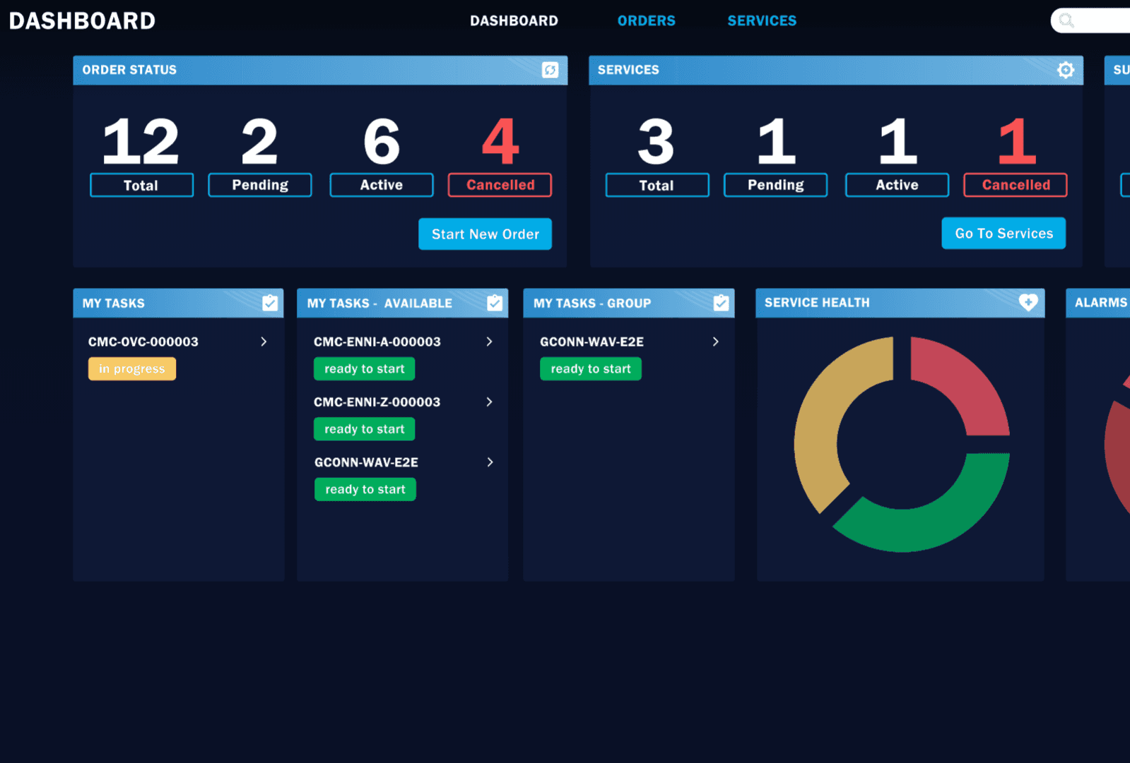
The CTO/VP suggested several refinements to improve both usability and aesthetics. They recommended removing the welcome message to create more space, making dark mode the default, and introducing a collapsible sidebar for flexibility. Additional suggestions included moving settings, help, and logout options into the user dropdown, and making the dashboard layout more scannable overall.
Actions taken
◆
Refined dashboard layout for improved clarity and spacing
◆
Consolidated settings, help, and logout into the role dropdown
◆
Implemented collapsible sidebar for flexible screen space
◆
Set dark mode as the default display
◆
Streamlined navigation bar for faster access to key areas

Final Solution

◆
Fully interactive desktop mock-up
◆
Delivered as a secure link contained within an index.html file
◆
Used for internal reviews, planning, and stakeholder demos
◆
Replaced 10+ static documents with a single interactive prototype
◆
Enabled backend work to start 2 weeks earlier
◆
Cut developer clarification requests by ~40% during planning
◆
Gained full stakeholder approval after second iteration
◆
Gained full stakeholder approval after second iteration
Client Review

Mark Gilmour
ConnectiviTree (CTO)
lessons Learned
◆
Starting from one key screen made it easier to keep patterns consistent
◆
A simple clickable prototype communicated decisions better than static slides
◆
Next time I would use Figma for faster component reuse and comments
◆
Basic usability checks, even with a few people, would improve interaction choices

